


Mastering the Art of Brand Colors
Your brand colors tell your story instantly. I help holistic coaches craft palettes that reflect their essence and connect deeply.

Transformative Colors & Branding
Colors tell a story long before words are spoken. For any brand, the colors chosen are more than just decoration—they’re an expression of the brand’s soul. As an artist brings a blank canvas to life with shades and hues, a brand uses colors to convey its values, personality, and mission. Let’s explore the importance of brand colors and how Heartbeat.buzz, my digital creation, embodies this philosophy.

What Are Brand Colors?
Brand colors are the visual foundation of your business identity. They’re carefully selected to reflect your brand’s personality and communicate its essence. Typically, they are divided into primary and secondary colors, working together to create a cohesive and impactful visual presence.
As artist Wassily Kandinsky once said,
"Color is a power which directly influences the soul." ~Wassily Kandinsky
This highlights how choosing the right colors can create an emotional connection with your audience, especially in holistic coaching and wellness spaces where feelings, energy, and authenticity are key. Typically, they are divided into primary and secondary colors, working together to create a cohesive and impactful visual presence.
Primary Brand Colors – The Core Palette
Your primary colors are the cornerstone of your brand identity, consistently appearing across all touchpoints—your website, social media, marketing materials, and more. These colors represent the core values and emotions you want your audience to associate with your brand.
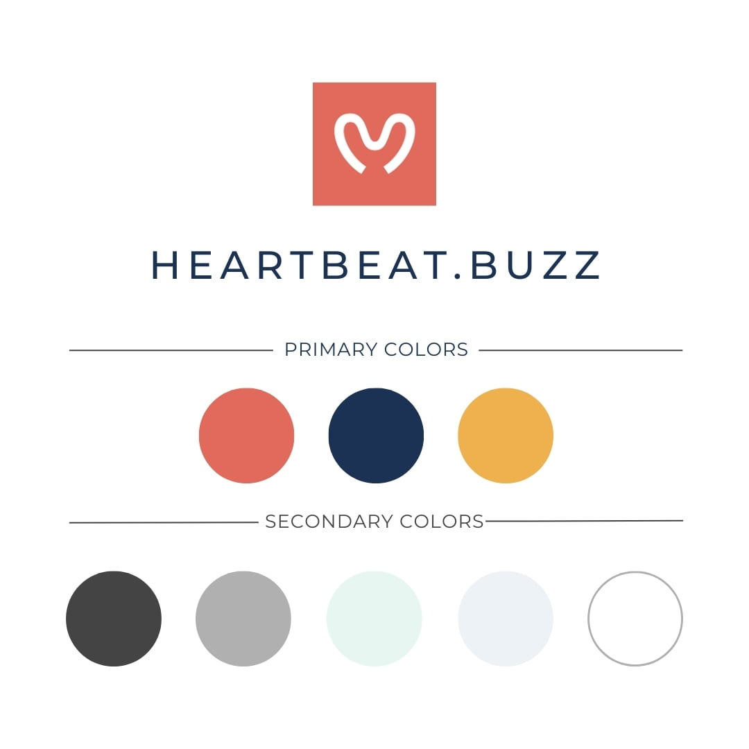
At Heartbeat.buzz, my primary colors are:
#E26A5C – A vibrant red representing passion, energy, and heart-centered creativity.
#1B3255 – A deep navy blue that evokes trust, reliability, and expertise.
#EFB14E – A warm gold symbolizing optimism, clarity, and a bold vision.
These colors aren’t just aesthetic choices—they embody the very essence of Heartbeat.buzz’s mission to provide heartfelt, trustworthy, and visionary digital solutions.
Secondary Brand Colors: The Supportive Ensemble
Secondary colors add versatility to your brand’s palette, enhancing the core colors while offering flexibility in design. They complement the primary colors, creating depth and richness.
The secondary palette for Heartbeat.buzz includes:
#E8F6F2 – A calming mint green for harmony and growth.
#444444 – A versatile dark grey for balance and sophistication.
#B0B0B0 – A neutral grey adding practicality and modernity.
#EDF2F7 and #FFFFFF – Clean, crisp whites symbolizing simplicity and fresh starts.
Together, these colors help Heartbeat.buzz create a consistent, engaging visual identity across all platforms.
Bringing Colors to Life: A Case Study of Heartbeat.buzz
When you visit Heartbeat.buzz, you’re greeted by the warmth of red, reassuring depth of blue, and the bright optimism of gold. These colors guide your experience, subtly communicating the brand’s essence from the very first click. Each color choice reinforces Heartbeat.buzz’s commitment to creativity, trust, and forward-thinking solutions. It’s not just design—it’s storytelling through color.
Why Colors Matter? The Psychology Behind the Palette
Colors evoke emotions and influence perceptions. At Heartbeat.buzz, every color was chosen with intention:
Red sparks energy and passion.
Blue builds trust and conveys expertise.
Gold inspires optimism and clarity.
This intentional use of color ensures that every interaction with the brand feels authentic, memorable, and emotionally resonant.
“Heartbeat.buzz isn’t just about delivering services. It’s about creating an experience that resonates deeply with our clients. Our brand colors are a visual extension of our values and vision.” ~ Sebastian, Heartbeat.buzz
Developing Your Brand Colors
For coaches and holistic entrepreneurs looking to build an authentic brand, start by reflecting on your core values. What emotions do you want to evoke? What message do you want to convey? Choose primary colors that embody these elements. Use secondary colors to add flexibility and depth. Remember, consistency is key—let your colors tell your story across every platform.
Quick Cheat Sheet for Choosing Brand Colors:
Red: Passion, energy, action
Blue: Trust, calm, professionalism
Green: Growth, harmony, balance
Yellow: Optimism, clarity, creativity
Purple: Wisdom, spirituality, luxury
Black: Sophistication, power, elegance
White: Simplicity, purity, minimalism
Choosing the right brand colors is more than a design decision—it’s a strategic move that shapes how your audience perceives you. At Heartbeat.buzz, every color reflects my commitment to heartfelt, impactful digital solutions.
If you’re ready to develop your brand’s color story, let’s connect. Together, we’ll create a palette that captures your brand’s heart and vision.